Showing posts with label calligraphy. Show all posts

Thursday

Western Calligraphers in Singapore


A couple of us Western calligraphers in Singapore were interviewed by the Sunday Times recently. The above article, ‘Old script, new uses’, appeared in the Life! supplement on 26 May 2013.

As a calligraphy enthusiast who does not do commissioned work, I am delighted that there are now two young calligraphers — Ong Fang Zheng and Clarence Valerius Wee — to whom I can refer the almost-weekly requests I get from wedding planners and designers looking for a calligrapher.

This article was, I understand from the journalist, originally to have featured calligraphers in general, i.e. including those from Chinese and other traditions, but its eventual focus was narrowed to Western calligraphy. I was asked to provide samples of three hands — Gothic, Italic and Copperplate — but I proposed Foundational in place of Gothic as the Germanic script is one I have never been able to master, and probably never shall.

Western Calligraphy Workshops


These are listings on the GoLibrary website for two workshops I conducted in the month of May 2013, at Serangoon Public Library on Saturday the 11th and Bedok Public Library on Saturday the 18th.

Although two-and-a-half hours long, these sessions are very well attended and participants seem to enjoy themselves. In fact, it is always a rush to cover everything from holding the pen to making basic strokes with it, and from writing the small and capital letters to writing words, names and messages.

These sessions are free of charge, and participants get a calligraphy marker to keep. As an instructor, I am not paid a fee either; this is entirely voluntary work and I get a huge sense of satisfaction when the class goes well.

Wednesday

Western Calligraphy: The Splendour of the Letter


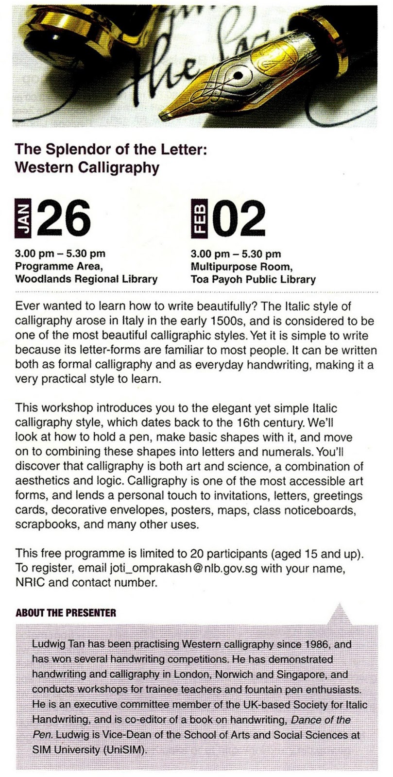
This year I’ve had the pleasure of teaching two Italic calligraphy workshops to the public, through the National Library Board (NLB) in Singapore (Woodlands Regional Library on 26 January 2013; Toa Payoh Public Library on 2 February 2013). 

When I did my first workshop at Woodlands, it struck me that I was finally fulfilling my dream of teaching calligraphy to adults — a wish I had had since picking up Italic at the age of 16. Back then, every time I passed by the community centre near my house, I’d think how cool it’d be to teach adults.

This (below) was the registration table at the Woodlands workshop. The facilitator, Ms Joti Omprakash, was extremely helpful and efficient — as you can see, she and her colleagues actually arranged for calligraphy titles in the library to be made available for loan. 


I began with a slide show telling the audience about how my calligraphic journey started.


Below, I’m showing them an example of Spencerian, which I’d scribbled with a ballpoint pen.


It was heartening for me to see that my workshops attracted many young people. This is a group of students from my alma mater Ngee Ann Polytechnic, who told me they were training to be art curators. Polys are truly innovative these days!


My next workshops will be on Saturday 11 May (Serangoon Public Library, at Serangoon Nex) and 18 May (Bedok Public Library).

Saturday

Calligraphy for Charity (December 2012)

Here are five pieces of calligraphy I did in December 2012 for Bright Vision Hospital in Singapore. My small contribution was part of a project to adorn the white walls of the new extension with artwork to bring cheer to the patients — other people contributed photographs, paintings and drawings, of a much higher standard than my own work.


Calligraphy Workshop

Every year, I am deeply honoured to be invited by trainee teachers at the National Institute of Education (NIE), Singapore, to conduct my ‘Western Calligraphy 101’ workshop at their annual Learning Festival.

This Festival is a splendid idea — lessons are cancelled for a large part of the day, and students and staff are encouraged to hold and attend workshops that teach skills not on the Institute’s curriculum, such as life-saving, muffin making, tea appreciation, and balloon sculpting.

I’m proud to report that my calligraphy workshop has been running for five years, and response continues to be very encouraging. Here are two photos from my workshop on 5 September 2012.


Thursday

Italic Exemplars (August 2010)

It’s been almost a year since I last posted.  How time flies!

I’ve been meaning to post these for the longest time: two Italic alphabets, one showing the recommended order of strokes and another, cleaner one showing some letter variations, and a guide sheet for writing on.  The alphabets are hardly perfect, but I trust they are clear enough.

I usually give these as handouts when doing calligraphy workshops: one copy each of the two alphabets, and four copies of the guide sheet.  And I bring a pile of guide sheets just in case people run out of them.


Vive et Vivere (October 2010)


I was recently asked to write this for someone who wanted to put it up in her office cubicle. Apparently in Latin it means ‘live and let live’, but google this and you’ll find different formulations, including vive et sine vivere.  I know hardly any Latin, not having had the privilege of a Classical education, but I do know that word order is extremely free in the language because verbs and nouns are highly inflected for case and agreement, among other things.  Presumably, what I’ve written literally means ‘live and to live without’, but this is just a guess.  Written with a Kuretake marker.

Christmas Card (2008)


This was written for fun on a scrap of art paper measuring 4.5 by 6.0 centimetres, which is roughly the size of a gift tag.  Flourished Copperplate using a vintage Hunt 56 nib and Talens gouaches (deep gold + silver).

Photographed handheld using Canon 5D Mark II and 100mm f/2.8L macro IS USM lens.

Rude Calligraphy (September 2006)


These were three pieces commissioned in September 2006 by a freelance copywriter, whose name I’ve forgotten, for the Creative Circle Awards — a competition in which ad people create fictitious products and ad campaigns for fictitious clients. The product here was a toothpaste so pleasant that, however vile the user’s words might be, they’d still come out sounding sugar-coated. For my efforts I was paid a couple of hundred dollars, a bonus considering that I badly needed practice at the time and would gladly have done it for free.

P.S.  The last piece is particularly awful; I’ve never sat down to learn Gothic lettering properly.

Tuesday

Guests (June 2003)


I was recently reminded of this when I stayed with two Scottish friends — I had written it for them as a parting gift on June 8, 2003, shortly before I left the UK for good. 

The main message is at first glance complimentary — Our guests always give us pleasure.  But the smaller text below adds, seemingly in a whisper, Some by coming, others by leaving. 

I can’t remember where I got this quote from, but if you do a Google search you’ll probably find different variants of it attributed to different people.

Sunday

Christopher Brennan Poem (2010)


This is a commissioned piece I did in mid-March, for somebody who was intending to read this poem while  proposing on bended knee to the girl he wanted to marry. 

A similar piece usually takes me 7 or 8 hours to do, approximately two-thirds of which is spent ruling up the sheet and writing everything lightly in pencil first.  (The actual writing is, in fact, the easy part.)  But fortunately this piece was sent to me already typed and nicely laid out, so, apart from minor tweaks, I did not have to work out line spacing and x-height myself.

An easy job, then, though it came at a time when I thought I couldn’t get any busier!

Italic Practice (2010)

I often practise my calligraphy while listening to the BBC news or before going to bed — like cooking, it can be incredibly therapeutic.  Writing on old newspapers (on pages not covered with too many pictures) allows one to cover acres of paper without feeling too guilty about deforestation.  I usually write out whatever words I hear on the radio or spy on the pages on which I’m scribbling — or I make up words containing letters which I wish to improve or refine, for example c, o, r and g, which at the moment I’m trying to understand better.

Tuesday

Bookmark (2005)

Before my English classes got too big, at the end of each semester I always gave every student a bookmark with her or his name written in calligraphy — alternating between Italic and Copperplate if I taught the same student twice.  A fine way to pass on my passion for calligraphy and give students something they tend to see as rather English, I think.  Now that I typically teach more than 200 students a semester, however, this is no longer possible — a classic case of ‘the spirit is willing but the flesh is weak’!

The name above is in the Copperplate (English Round Hand) style, and was written with the pictured Hunt 56 vintage nib.

Sunday

Italic Scribble (2010)


Some scribbling I did today with a Kuretake Calligraphy marker, on a postcard found in every issue of Time magazine, enticing potential subscribers with offers.  An incredible waste of paper, methinks, if not put to better use!

Calligraphy can be extremely therapeutic, especially if it is carefree scribble, and not serious commissioned work, that one knows will not be subjected to ruthless scrutiny.

Tuesday

More Whiteboard Writing (2008)

Another example of calligraphic scribbling I sometimes do for fun, again with two whiteboard markers banded together, and in the Italic style.  Horizontal strokes have been rendered a bit too thick because my penhold was wrong — the ‘nib’ should be held 45 degrees to the writing line, but this was closer to 60 degrees.

Incidentally, the Admiral Vernon is a covered market that forms part of Portobello Road Market in London, which I used to visit on Saturdays when I was a student at Cambridge, and a fountain pen collector.

Whiteboard Writing (2009)

A quote by Thomas Paine, written on a whiteboard with two round-point markers banded together.  As you can see, it’s not easy to write straight at this size (x-height approx. 15 centimetres or 6 inches) without the help of guidelines! 

When doing calligraphy workshops I usually project guidelines (on a PowerPoint slide) onto the board using a projector, taking care to ensure that the slide is quite dark (e.g. grey) so it doesn’t dazzle the audience.  This was written as I was winding down after an English grammar class that ended late in the day.

The Ingleezee Khafir (2000)


This is a piece I wrote c. 2000 as a birthday gift to an Irish friend.  It’s a poem by one of his favourite Irish poets, James Clarence Mangan. 

Despite its Middle Eastern feel, the poem is in fact filled with derogatory references to the English, for instance Ingleezee = English; and Djaun Bool, which clearly is John Bull, ‘a national personification of Great Britain in general and England in particular, especially in political cartoons and similar graphic works ... but has not been accepted in Scotland or Wales because he is viewed there as English rather than British.... Although embraced by Unionists, Bull is rejected by Nationalists in Northern Ireland as well’.

Sunday

Christmas Message, 2009


This was the message inside my Christmas card this year.  Written with a Kuretake Calligraphy marker, and reduced.  The ascender of the final d in ahead, as originally written, sloped too far to the right.  This was rectified in Photoshop — first, I selected that portion of the letter, then used Transform/Skew to bring it in line with the slope of the rest of the message.  Finally, I cleaned up the d by cloning and erasing parts of the letter.

Monday

The Universal Penman, 1741


One of my favourite calligraphic styles is the 18th-century English Round Hand, known more commonly these days as ‘Copperplate’.  It is notoriously difficult to write well, but I try to stay faithful to the original by studying the splendid resource, The Universal Penman (1741), a collection of engravings by George Bickham of the works of the best penmen of his day, including his own.  This extract is from Plate 90, written by Willington Clark and engraved by Bickham.

Friday

Poster for a Talk (2007)


The beautiful poster you see above, for a talk on the use of humour in teaching, was put together by Fiona Jeremiah, a teacher with a gift for design.  My contribution (below) was the title and subtitle, which I wrote in black, using a calligraphy marker.